Dulux forecasts the colours of 2021

Reset is an uplifting and optimistic palette of enriching and brighter hues. Photo: ARMELLE HABIB Stylist: Julia Green


The global crisis has changed our relationship with our homes, and not just on a practical level – the lines between our work and home have
blurred beyond recognition.
Dulux’s colour and communications manager Andrea Lucena-Orr said this change also affects us on an emotional level.
“We need flexible spaces that can multi-task as spaces to conduct our professional lives and perform household tasks, however, at the same time we need our homes to provide balance, calm and a sense of comfort and security.”
In response, design trends for 2021 will reflect our desire for reassurance and strength, with nurturing palettes drawn from nature and furniture and décor that speaks of familiarity and comfort.
At the same time, expect to see unpredictable material and colour combinations creeping in that encourage us to adapt our homes to new ways of living and working.
The Dulux colour team research trends consistently throughout the year, staying connected with international colour trend professionals and keeping informed of local and global lifestyle influences to predict global trends and how they will
affect Australians. With most European design and architecture shows cancelled this year, the Dulux Colour Forecast for 2021 has been informed by extensive virtual research into global trends to stay abreast of key product updates and launches The Dulux Colour Forecast for 2021 comprises three soothing palettes, inspired by nature along with moments of stronger colour to lighten the mood and brighten our outlook.
“Surrounding colour can be a remedy for the soul in challenging times,” Andrea says.
“This year’s soft, earthy neutrals, muted greens and gentle mauve-greys provide a
reassuring connection with nature, whilst richer and brighter hues, such as coral and stormy blue awaken our senses and allow for moments of optimism.”
Retreat is a palette of warm whites, brown-based neutrals and dusty blues that conveys a sense of a soft luxury, alongside vintage-inspired tones of
burgundy and deep ocean blue.
With gentle, buff neutrals and touches of tan, soft olive and muted ochre, the Nourish palette captures our renewed appreciation for natural beauty.
Reset is an uplifting and optimistic palette of enriching and brighter hues; rich blue and coral, warm rust and playful mash-ups of pink and terracotta hint at 70s nostalgia and evoke memories of travel and fun.
“Months of being stuck indoors staring at the same four walls creates the urge to pick up a paint brush that’s impossible to resist,” says Lucena-Orr.
“Taking inspiration from the 2021 palettes is a great place to start when choosing colour for your home.
You’ll also need to consider existing colours in your scheme, such as sofa upholstery, carpet tones and joinery finishes, to ensure the colour(s) you love will
sit comfortably together.
She said the important decision was to understand what look and feel you’re trying to create.
“For a subtle, neutral look, Nourish is a good palette to work with. For something moodier and more dramatic, try the Retreat palette.
If you’re keen to incorporate bold tones that won’t overwhelm a space, consider the brighter hues in the Reset palette. And don’t forget, you can always select
colours between the palettes to create a look that’s all your own.
“Simple ways to introduce colour include painting your front door, creating an accent wall behind your bed or in a study nook, or adding a cheery, welcoming colour to your hallway. Many of the colours in this year’s forecast will work beautifully on exteriors too.”
To learn more about Dulux’s 2021 Colour Forecast, head to dulux.com.au.
Share


Related Articles
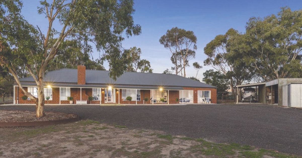
The complete lifestyle package: 159 Murradoc Road, Drysdale
PRIVATELY positioned on about 1.10ha, this extensively renovated lifestyle property…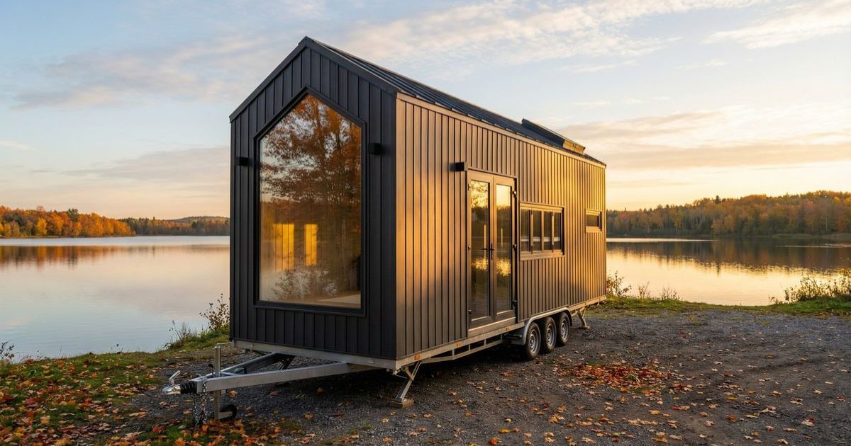
Tiny homes have lofty ambitions – and buyers are taking notice
AN idea with a tiny footprint could have a big…