Demons’ 150th logo up for voting

Portarlington Demons president Steve Cogger says the club's board will come to a final decision in the next month once the community has voted. Photo: VINNIE VAN OORSCHOT
PORTARLINGTON Football and Netball Club community and committee board will come to a decision on what the club’s logo will look like for its 150th year, with the final design down to the two choices that were unveiled earlier this month.
The Demons’ new logo, which will feature on all branding and merchandise for the club’s milestone year in 2024, will be decided on within the next four weeks, according to club president Steve Cogger.
“The decision to create a new club logo is quite high up on the agenda ahead of our big year in 2024, the new emblem will act as a catalyst to carry us forwards into future years and we will start to move away from the demon design we have had for a number of years now,” Cogger said.
“It will essentially mark the beginning of a new era for us and there is a real excitement for the new logo and another year of improvement like we are seeing at the moment.”

The club started with half a dozen logo designs to choose from, which has dwindled down to two.
Both of which are based on a ‘shield’ template and will keep the club’s traditional navy and red colours.
Each design also includes indigenous artwork to acknowledge Portarlington as a meeting place of the Wadawurrung people.
The journey lines on both logos represent the club’s journey from the past into the future.
More than 400 community and club members have voted on one of the two final options.
“Option 1” is the early frontrunner as voted by the community, but Cogger personally favours “Option 2”.
“The shield style was the most agreed upon design concept, it gives more of a professional look,” Cogger added.
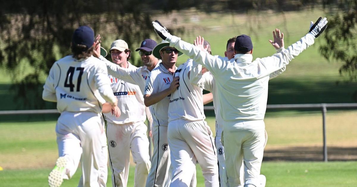
“For me personally, Option 1 is very similar to the cricket club’s, and we have to be completely respectful of them and I just feel the design is too similar to theirs.
“I also think the word ‘Portarlington’ on the second option just stands out a lot more, but like everyone else, I only get one vote.”
To vote, head to Portarlington Football Netball Club’s Facebook post from May 10 and follow the instructions accordingly.


