A new era and a new look for Spirit

Bendigo Spirit has paid tribute to the past, present and future with a club rebrand, including a new logo. Image: SUPPLIED


AS Bendigo Spirit builds towards an exciting new era on and off-the-court, the Women’s National Basketball League club has unveiled a brand-new logo as part of a wider club rebrand.
The rebrand – launched late last week – comes at exciting time in the evolution of women’s basketball in Australia.
With more people than ever watching the WNBL or following the game via various media platforms, the Spirit was eager to take advantage of the opportunity for growth with new branding.
SEN Teams owns the Bendigo Spirit licence and its CEO Richard Simkiss said the rebrand was evidence of the organisation ‘doubling down’ on its commitment to Bendigo.
“Our commitment to Bendigo is unwavering,” he said.
“We see the Bendigo Spirit not just as a team, but as a vital part of this regional Victorian community.
“Investing in the Spirit is about more than sport – it’s about building trust, fostering connection, and showing that Bendigo Spirit is here for the long haul.”
The redevelopment implements a contemporary, vibrant and sleek brand that best represents the Spirit as the club moves into the 2025-26 season and beyond.
It has won the immediate backing of the playing roster, with 2024-25 championship-winning captain Kelsey Griffin saying the new look would honour all who had come before the club’s current playing group.
The new branding both pays homage to the club’s past and builds on its current identity.
It includes a brighter blue and yellow colour scheme, demonstrating power and clarity, professionalism and a slightly feminine energy, to retain the heart of the brand.
The Spirit has also seen an opportunity to enhance its community ties to Bendigo, honouring those who support the team most.
Not only does the revamped colour scheme reflect more closely to other representative teams across the city, including the Victorian Netball League’s Bendigo Strikers and the BFNL’s representative football and netball teams, the logo also works to incorporate important elements of the Bendigo community.
This includes the addition of the iconic Bendigo poppet head – an image synonymous with historic mining towns – and an Australian wedge-tailed eagle.
The eagle holds strong relevance to the traditional owners of the land on which the club operates, the Dja Dja Wurrung people.
Honing in on one of the most important aspects of the game, the athletes themselves, the rebranding of the logo includes stars, conveying the inherent resilience and determination of the players – both past and present – recognising them as the true stars of the game.
Spirit general manager Dan Jackson said there was no better time for the club to reinforce its commitment to its home in Bendigo.
“Our original logo has served us well and has a fantastic history of its own, but with the increasing number of eyeballs on our sport in this day and age, we feel like this new, modern iteration of our brand will give us the platform to continue to represent Bendigo and regional Victoria long into the future,” he said.
WNBL legend Griffin said the most exciting aspect of the rebrand was that it was much more than just a new logo and colours.
“It’s about honouring everyone who’s stood by the Spirit through all the highs and lows,” she said.
“I believe a logo holds true meaning when it represents the people and stories behind it, and my hope is that this one will do just that.
“When people see this new logo, I want it to honour every player, fan, volunteer, sponsor, partner, and staff member who’s helped shape the Spirit over the years.
“Without you, we wouldn’t be where we are today.”
“By honouring our history and moving forward with purpose, my hope is to be a part of creating something that Bendigo can be proud of for generations to come.”
Share


Related Articles
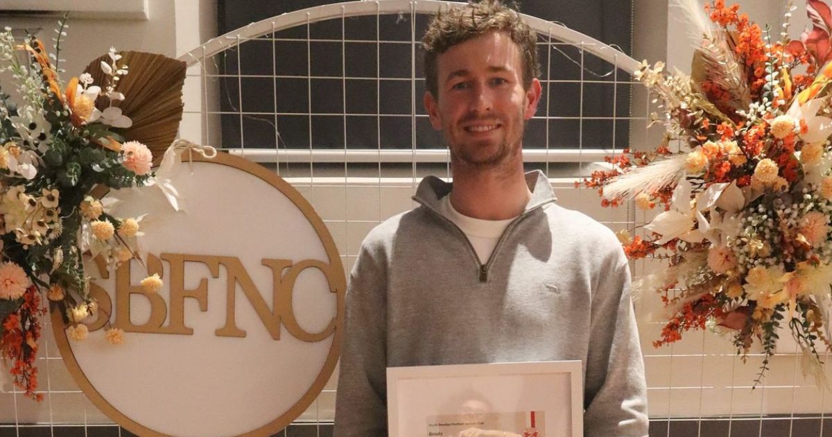
Haddow, Richards top Bloods in ’25
CLASSY midfielder Brody Haddow and goal shooter Gabe Richards have…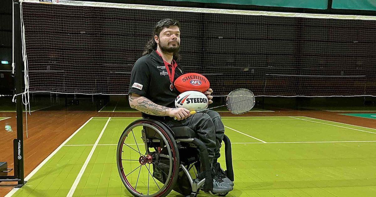
From badminton to rugby, Logan’s embracing new sporting endeavours
BENDIGO para athlete Caleb Logan has never been one to…