Dulux forecasts warmth, positivity in 2024 palette

Dulux Muse is a colourful array of hues predominantly within the midtone.


Celebrating the 25th anniversary of the annual Dulux Colour Forecast, this year’s trends reflect an inner desire for positivity and spaces that nurture within our homes.
While the inclusion of mid-toned hues create a central theme, with rich golds, olive greens and reddy browns exhibiting warmth, each of the three palettes are distinctly different and are certain to appeal to consumers nationwide as the next evolution in colour trends emerges.
Led by the Dulux Colour Team, comprising of colour and communications manager Andrea Lucena-Orr, colour forecaster and stylist Bree Leech and colour manager Lauren Treloar, the annual forecast is based on year-round research into the latest global and local trends that are predicted to influence Australian interior design and how we live.
“The team is informed by seminars, including Future Laboratory London and Colour Hive, Milan Design Week, where this year we hosted a special event to celebrate our 25th anniversary,” Treloar said.
“We also dissect trend reports and editorials, attend fashion catwalks, product and design launches, engage with global and international brands, and review customised research through Dulux’s extensive networks in the UK, Italy and France.”
Lucena-Orr said every Colour Forecast was significant, as colour and design continued to evolve.
“As design exists on a global platform there is always something new and exciting, and being our 25th anniversary of the Dulux Colour Forecast makes 2024 very significant.”
“There is a really important element to this year’s forecast in the way it invites colour and texture into the home.
We can see yellow and rich gold becoming more prominent in this year’s palettes. Furthermore, the zesty green and clay brown shades that we saw coming through in the 2023 Colour Forecast are transitioning to a warmer space, featuring yellow and subtle red undertones.
We are seeing some lightness in colour, however the majority of shades are mid-tone with darker shades predominantly used for small accents. The warmth we’re seeing across each of the 2024 Colour Forecast palettes is the answer for consumers who are looking to add positivity by adding colour in their homes.”
Alongside warmer palettes, Leech said tactility would be another important focus for the year ahead.
“Overall the 2024 Colour Forecast palettes have become more sophisticated, whilst tonal palettes are still popular and particularly comforting. This year we see a shift towards the use of multi-hue schemes, but crafted to reflect a balanced interior.
The colours are richer and there are less pastel and bright hues, compared to what we saw last year with a shift towards more sophisticated nostalgic references.”
Mid-tones are best used on all four walls, particularly in bedrooms vand living spaces, but even introducing one or two of these colours through paint or accessories can help to keep your home in the current era.
“Just changing one space is inspiring and helps you connect and influence emotions through colour,” Lucena-Orr said.
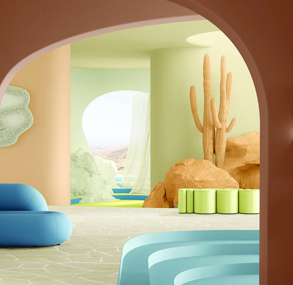
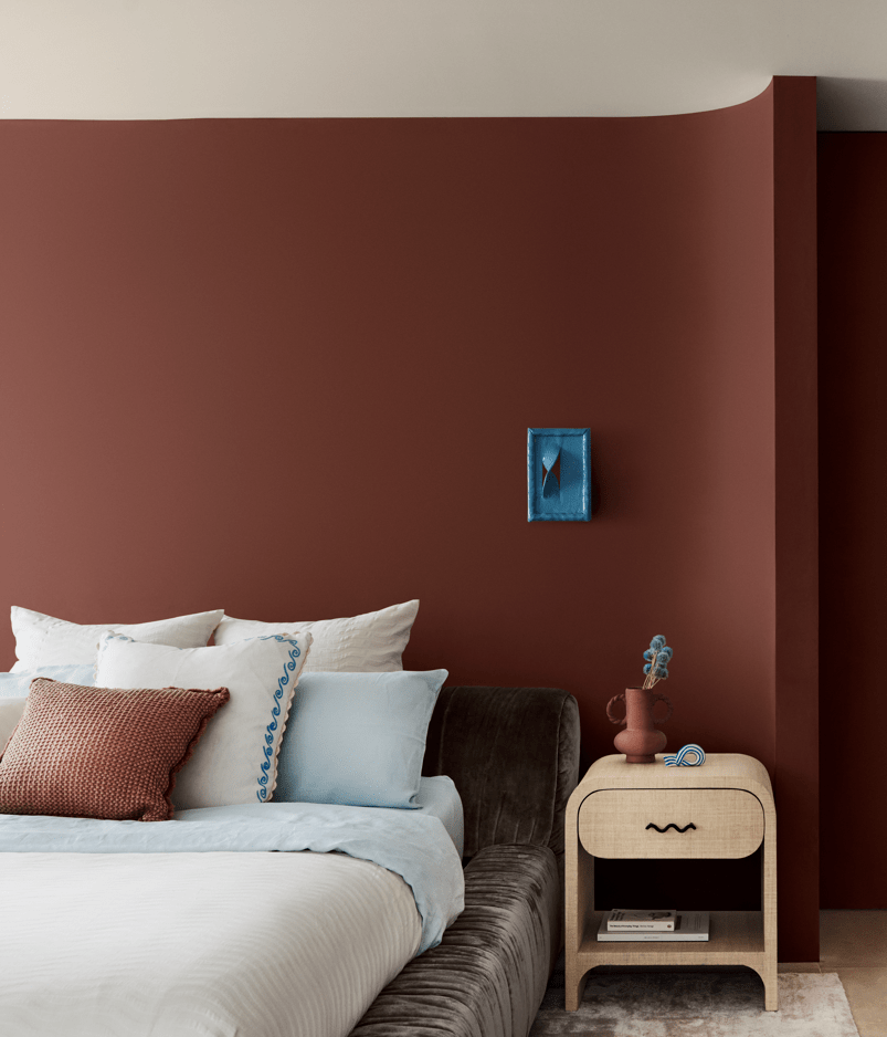
A melting pot of Mediterranean, Scandinavian and African influence, the Dulux Solstice palette connects to the sun as its life force and serves as a reminder that as the days grow longer, better days are ahead.
The trend is rich with organic and primitive shapes, with colours that wrap warmth around us to evoke feelings of security and strength.
Walls predominantly feature clay brown shades with red undertones, including Dulux Tan Wagon and Potter’s Pink and golden neutrals such as Dulux Lama and Handmade Linen Half.
Creating a sense of comfort, these sun-soaked shades are adorned with accents in lighter blues, including Dulux Pure Blue and Ocean Surf, and zesty yellows such as Dulux Ripe Lemon.
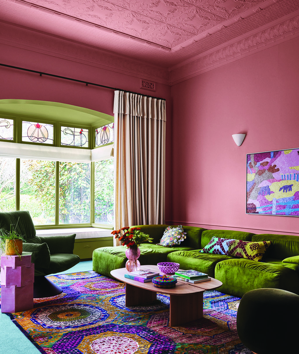
Taking influence from our travels, folk traditions and cultural differences, the Dulux Journey palette weaves together elements of bohemian charm, eclectic allure and highlights the art of craft.
A maximalist and pattern-heavy palette, Dulux Journey is about the story of an interior with a focus on the objects and items handed down and the rich ancestral heritage they represent.
Similar to the rich and diverse tapestry of our own lives, the Journey palette beckons you in with an overarching warmth.
This trend brings together rich mid-tone hues, with yellow greens, such as Dulux Xena and Dulux Bean Counter, and blues such as Dulux Swedish Blue and Dulux Clouded Sky, alongside rich decadent reds and plum, including Dulux Carmen and Dulux Bruised Burgundy for contrast.
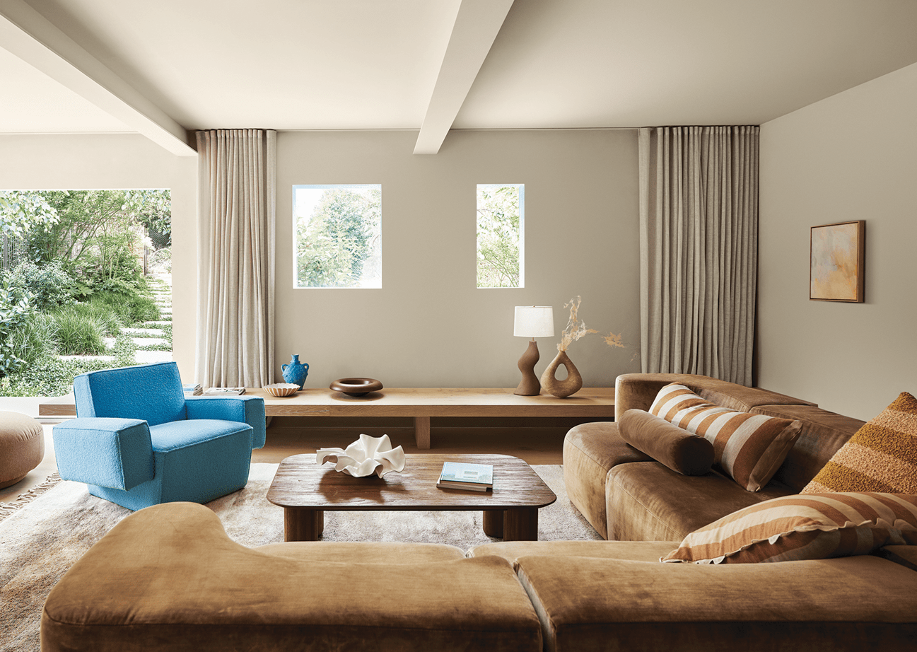
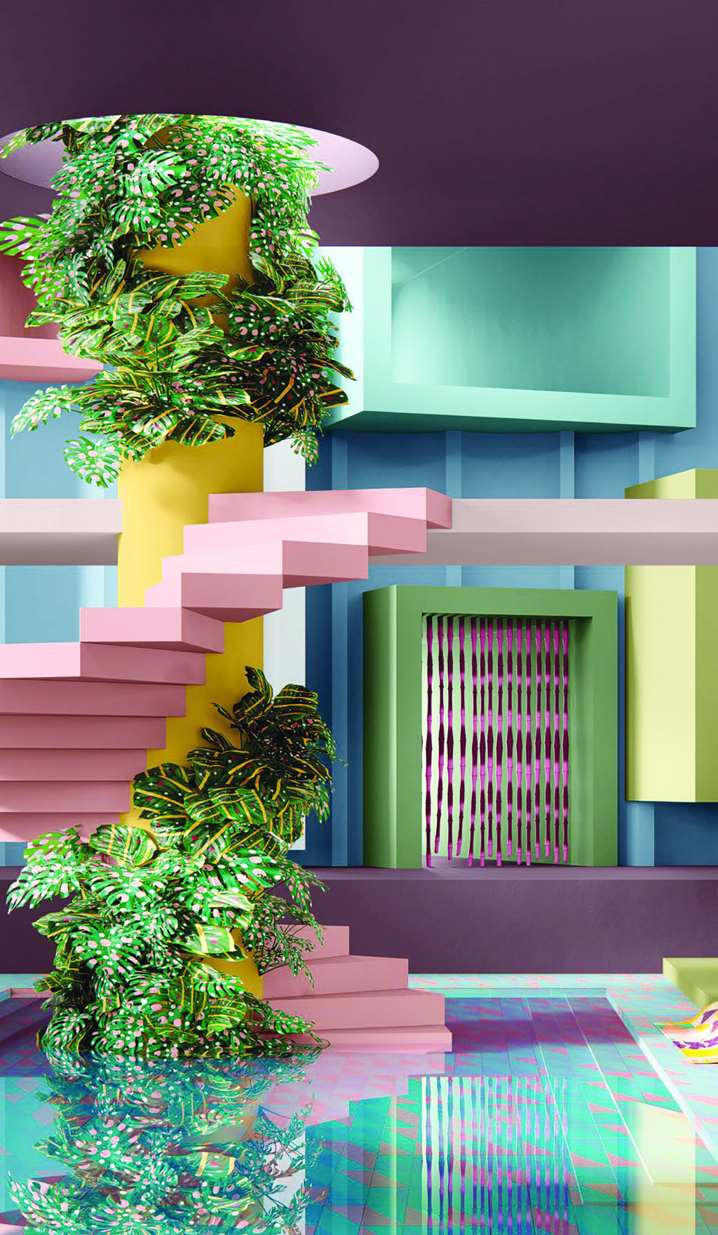
A colourful array of hues predominantly within the midtone, the Dulux Muse palette evokes a nostalgic feeling and celebrates iconic designers and design details from the ’60s through to the ’80s, with a particular focus on the glamorous and adventurous ’70s.
With contemporary design at its heart, the palette exhibits a sophisticated use of materials and textures.
Walls are painted in solid blocks of bold colour, with rich tans and russet browns featuring heavily, alongside cooler blues and greens, to inspire a feeling of unlimited creativity.
Share


Related Articles
Calling all cranky women with a grievance
AN Australian comedy veteran wants to know what is bothering…
Australia-wide music competition
A NATIONAL talent search could be the launchpad for the…