Forecasting tenderness and connection
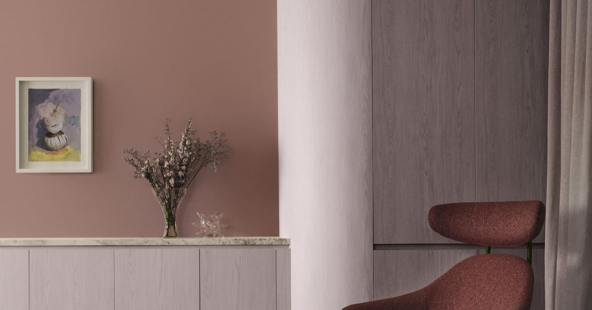
Ethereal features a delicate pastel-like blend of soft and mid-tone hues. Photos: LISA COHEN/DULUX Styling in all photos: BREE BANFIELD


DULUX has revealed its annual Colour Forecast for 2026, which sees a rise in calming and connecting colours in response to continued global uncertainty and digital fatigue.
Curated into three palettes – Ethereal, Elemental and Evoke – this year’s forecast champions warm earth-based neutrals, rich burnt oranges, caramels, and greens such as sage, moss and spearmint. Soft pinks and vintage rose tones also feature, alongside tender pastels and muted berry shades. While each of the three palettes are distinct, there is universal yearning for wellness, stability and reconnection that can be seen within each of the palettes.
Led by the Dulux Colour Team, comprising of Colour and Design Manager Lauren Treloar and Colour and Communications Manager Andrea Lucena-Orr, the annual Dulux Colour Forecast is grounded in extensive, year-round research into global and local trends set to shape Australian interior design and the way we live. Since its inception in 1999, the Forecast has become a trusted guide for designers, architects and homeowners alike.
“In times of uncertainty – including today’s cost-ofliving pressures and geopolitical unrest – consumers tend to gravitate toward stability in design,” Lucena-Orr said. “That’s why we’re seeing a continued preference for warm, comforting colours in this year’s palettes. Colour has the power to lift spirits, offer emotional reassurance and bring a sense of calm into our homes.
Ethereal features a delicate pastel-like blend of soft and mid-tone hues – gentle greens, mauves, and blush pinks – that evoke a sense of serenity and joy. “With romantic tones like Dulux Savin, Dulux Different Pink and Dulux Mask, alongside subtle pastels such as Dulux Tiamo, Dulux Blue Shell and Dulux Soft Fresco, this palette feels playful, uplifting, and quietly luxurious,” Lucena-Orr said.
Elemental is a tonal, grounded palette built around warm whites and neutrals such as Dulux Blended Cream and Dulux Hog Bristle Quarter and enriched with golden brown hues such as Dulux Caramel Sundae and Dulux Coffee Dust.
Lucena-Orr said subtle layers of grey, including Dulux Clear Concrete and Dulux Reckless Grey, bring stillness and structure, whilst darker charcoal tones add depth and dimension. “The result is a timeless, cohesive palette that feels quietly confident.”
Evoke is likely to be popular with home enthusiasts as the colours lean into deep, comforting tones rather than bright hues.
“Blush pinks like Dulux Baked Clay, burnt oranges like Dulux Magic Melon, and warm golden tones such as Dulux Germania are layered with deeper hues like Dulux Misty Grape, Dulux Wink and Dulux Red Jacks to create personality and depth,” Lucena-Orr said.
Share


Related Articles
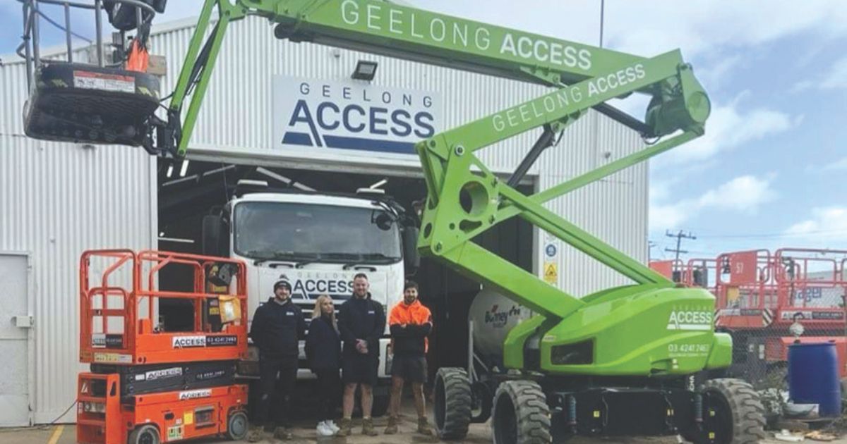
Family values drive business excellence for local hire company
CHRIS and Teoni Carney, the husband-and-wife team behind Geelong Access…
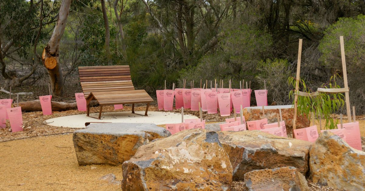
Work on kinder at Oberon Primary begins
CONSTRUCTION on a new kindergarten on the grounds of Oberon…