Solstice palette shines

Dulux's Solstice palette features rich warm hues with a freshness and lightness that isn't too heavy for warmer weather. Photos: LISA COHEN/DULUX Styling: BREE LEECH


Natural, golden hues that exude a beautiful radiance are coming to the fore this summer, evoking feelings of security and warmth.
Dulux colour and communications manager Andrea Lucena-Orr said entertaining at home was on the up, given tightening budgets and the increase to the cost of living, and colour was an easy way to help bring joy and positivity into a space.
“It’s a wonderful tool that helps to differentiate spaces from each other and achieve a sense of meaning and purpose within each room – even small volumes of warm colours can help make your home feel more inviting this summer.”
The Dulux Solstice palette perfectly captures this mood. Solstice sees rich warm hues with a freshness and lightness that isn’t too heavy for warmer weather.
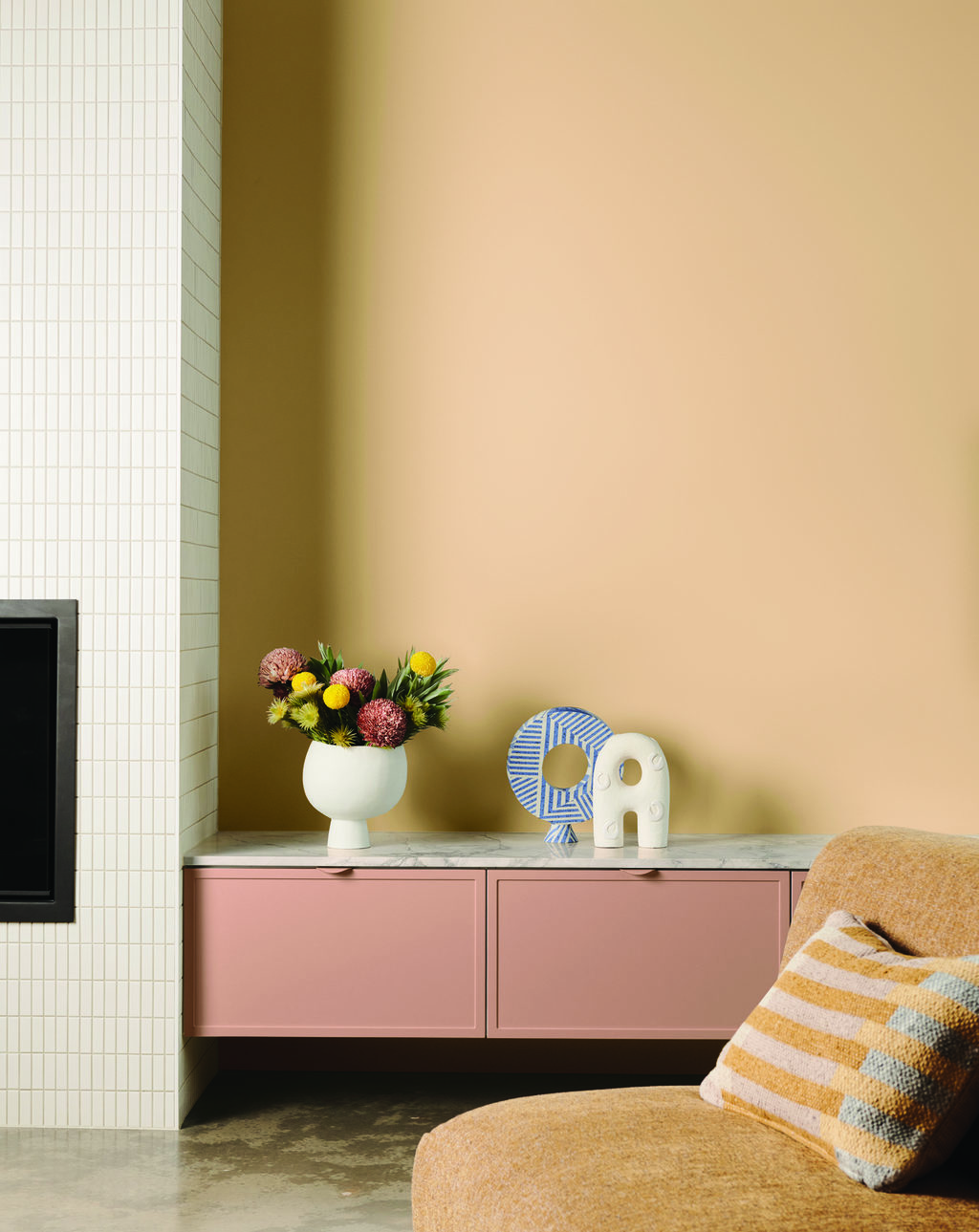
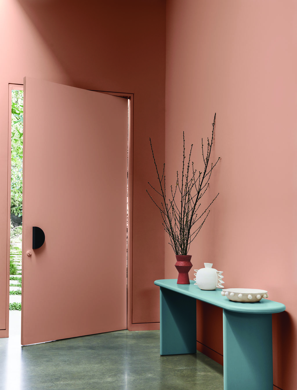
The palette includes sun-soaked shades including light, creamy yellows (Dulux Jodhpurs, Dulux Handmade Linen Half), paired with softer shades of pastel blues (Dulux Pure Blue, Dulux Ocean Surf) and clay pinks and browns (Dulux Potter’s Pink, Dulux Tan Wagon).
When it comes to introducing colours from the Dulux Solstice palette into your own home, Bree Leech, Dulux colour forecaster and stylist, can provide the inspiration you need, after recently using the palette to breathe life through colour into a new family home. Boasting a predominantly white, neutral palette, Leech worked her styling magic on a teen’s bedroom and the living room.
“We wanted both the bedroom and living room to evoke a feeling of cosiness, whilst still feeling light and complementary to the existing colour scheme of the home,” Leech said.
“The hues in Solstice are designed to be immersive, so colour has been used on all four walls within each space and we used pale blues, muted yellows and reddish-brown accents to add contrast to architectural features and decorative items.
“Dulux Lama, seen on the walls within the living room, is the perfect sandy hue with orange undertones that adds interest to a space without overwhelming it, making it perfect for open plan living where white has been used in adjacent spaces.
Clay hues can be seen on cabinetry (Dulux Potter’s Pink) and within soft furnishings to add extra warmth and make the room feel cosy. Elsewhere, soft blue accents highlight textures and styling pieces, including cushions, the rug, artwork and sculptural vessels.”
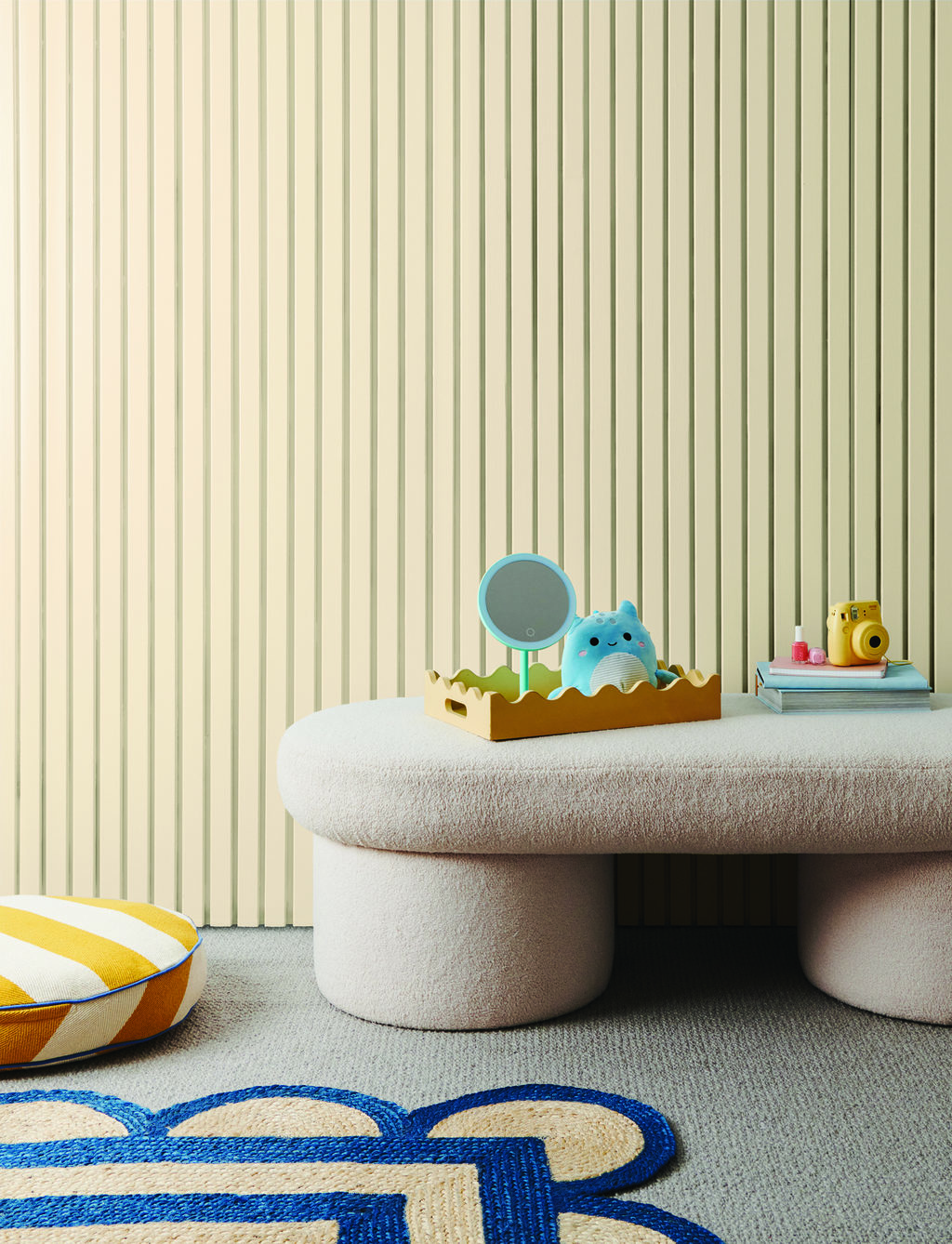
“The bedroom features the soft and joyful Dulux Jodhpurs, a muted creamy yellow colour that’s ideal for a teenager’s sanctuary. To create a sense of fun we added bedding with patterns such as gingham and checks and features like fringing and embroidery. The addition of quirky lamps and a scalloped rug show how using objects provides another way to add pops of colour to a space.”
“Organic and soft shapes are a key feature in the Solstice trend, so we avoided hard lines wherever possible to keep the feeling of the space casual and inviting. You’ll see rounded shapes dotted throughout both rooms, such as the curved sofa, the edges of coffee tables and in fun lampshades.”
For those wanting to create a joyful space in their own home, Lucena-Orr said Solstice could appeal to anyone as the colours are “so natural, warm and have a positive and uplifting essence.”
// Sponsored Content
Share


Related Articles

Construction begins on 420-lot Colac estate
Construction has started on a development in Elliminyt that will…
Plug in and power up: how EV charging could boost your property value
WITH THE UFINANCIAL TEAM A few years ago, asking about…