Energise your interior with Dulux’s summer shades

Dulux colour forecasters predict energising bright hues and graphic patterns will come to the fore in the warmer months. Photos: LISA COHEN/DULUX Styling: BREE LEECH


After a gruelling couple of years and a dreary, wet winter across much of the country, we’re ready to swing open the doors and welcome in a little joy this summer.
Dulux colour forecasters predict energising bright hues and graphic patterns will come to the fore in the warmer months, combined with a playful disregard for the so-called decorating “rules”.
“As our world opens up and we adapt to new ways of doing things, we’re looking for lightness and joy in our surroundings,” Dulux colour and communications manager Andrea Lucena-Orr said. “This is a time for reconnecting with the ones we love, and we want guests to walk into our homes and feel a sense of happiness and celebration. At the same time, after two years of restrictions, many of us are yearning for fun, freedom and the chance to try new things.”
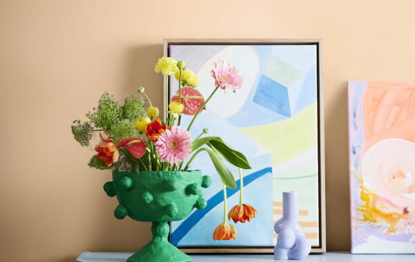
The Dulux Revive palette, which is one of three palettes identified in the Dulux Colour Forecast 2023, perfectly captures this mood. Revive sees vibrant hues, such as Dulux Integra (a rich blue), Dulux Diorite (a lively green) and Dulux Perplexed (a whimsical lilac) paired with over-scaled patterns, voluptuous furniture and bold, abstract artworks to bring an anything-is-possible optimism into our homes.
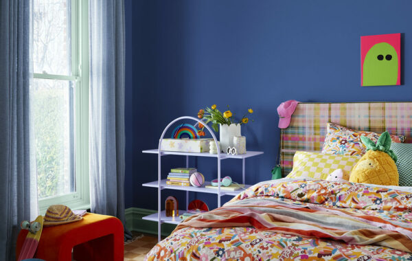
To fuel your design thinking when it comes to using the Dulux Revive colours in your own home, Bree Leech, Dulux colour forecaster and stylist, has used this palette to breathe new life into a predominantly white lounge room and a tween bedroom in a family home.
“If you’ve never swayed from whites and neutrals before, using saturated colours like these can feel daunting, but there’s really nothing to fear,” Leech said. “If you’re keen to try something a little different in your home and bring in some fun, the Revive palette is a great place to start. While the palette offers up plenty of bold and bright colours, there are grounding hues in there too that balance them out beautifully, such as Dulux Paper Brown, a warm brown-orange, and the ever-popular white, Dulux Lexicon Quarter.
“With huge steel-framed windows and sliding exterior doors that connect to the garden and fill the space with natural light, this family living room gave us a great canvas to work with. But with all-white walls and ceilings, and little in the way of texture or colour, it lacked depth and didn’t feel particularly inviting.”
“We started by painting the walls in Dulux Paper Brown, which instantly added warmth and character. To make the ceiling appear higher, we gave it a couple of coats of Breezy Half – a lovely, soft blue that’s perfect for brightening up open-plan rooms like this one. Taking the ceiling colour part-way down onto the wall, as we’ve done here, is a design trick to make the ceiling feel higher,” Lucena-Orr said.
“The Dulux Revive palette is a fabulous mash-up of futuristic and retro influences, which we really wanted to bring out in this room. We added curvy, statement seating with a distinctly ’80s feel in electric blue, paired with a highly textural feature chair and footstool in mustard for a hint of ’70s cool. The existing light fixtures and touches of high-shine steel in the coffee table legs further add to the retro-meets-contemporary vibe,” Leech said.
In the tween bedroom, Leech balanced calm with a sense of fun. Revive is a surprisingly versatile palette – depending on where you use the colours and in what amounts, you can create totally different moods. As a sleep space, she wanted this bedroom to feel restful, so she painted the walls in soothing and immersive Dulux Integra. For something a little unexpected, she used Dulux Diorite on the skirting boards, window trims and door, rather than traditional white.

“The existing colourful, upholstered headboard helped inspire the bedroom’s palette – drawing on the oranges, yellows and blues in new, brightly coloured graphic bedlinen. The rich blue walls worked as a backdrop to show off the sweet shape of the steel shelving featured in a similar hue to Dulux Perplexed. Finally, to ground the space and bring in some warmth, we added a rug that referenced Dulux Paper Brown, in a funky chequerboard pattern,” she said.
“Paint is the quickest, cheapest and most effective way to add personality to your home – all you need is a tin of paint, a couple of hours, and you can give a room an entirely new look,” Lucena-Orr said.
“And it’s not just your walls that can get the colour treatment – use paint to breathe fresh life into old furniture, your front door, planters, picture frames – practically anything you can imagine.”
Share


Related Articles
Sweet win for brownies at state food show
BRAZEN Brownies has won gold at the Sydney Royal Fine…
Tourism spend hits record $43.7 billion in Victoria
VICTORIA has recorded its strongest year on record for tourism…